
Summarise the information by selecting and reporting the main features, and make comparisons where relevant.
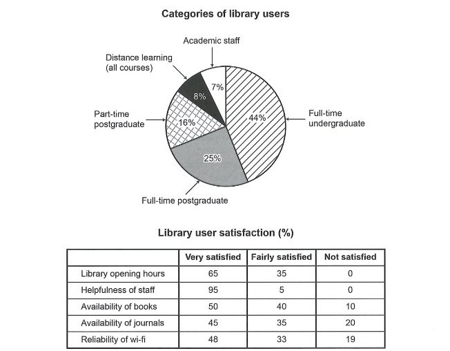
The bar chart illustrates the composition of library users at a university, categorised by their academic status, while the table presents satisfaction levels across five different library services.
Overall, full-time undergraduates constitute the largest group of library users, whereas academic staff represent the smallest proportion. Regarding satisfaction, library staff receive the highest approval ratings, while the availability of journals and Wi-Fi reliability attract the most dissatisfaction among users.
According to the bar chart, full-time undergraduate students account for the majority of library users, at approximately 38%. Distance learning students and part-time postgraduates each represent around 20% of users, while full-time postgraduates make up a slightly smaller proportion of about 17%. Academic staff are the least frequent users, comprising only about 5% of the total library clientele.
Turning to the table, the helpfulness of staff receives overwhelmingly positive feedback, with 95% of respondents indicating they are very satisfied and the remaining 5% fairly satisfied, with no negative responses recorded. Library opening hours also score highly, with 65% very satisfied and 35% fairly satisfied. However, satisfaction with other services is notably lower. The availability of books receives 50% very satisfied and 10% not satisfied, while journals perform worse, with only 45% very satisfied and 20% not satisfied. Similarly, Wi-Fi reliability shows mixed results, with 48% very satisfied but 19% dissatisfied.
In comparison, academic staff, despite being the smallest user group, appear to have the highest expectations, as they report lower satisfaction with journals and Wi-Fi compared to students.
Why this answer scores Band 7.0:
| Criteria | How the sample meets Band 7.0 requirements |
|---|---|
| Task Achievement | Addresses all key features from both the chart and table. Provides accurate data and makes relevant comparisons between the services. The comparison about academic staff's higher expectations adds value. |
| Coherence & Cohesion | Clear paragraph structure: introduction → overview → chart details → table details → insightful comparison. Uses effective linking words: Overall, According to, Turning to, However, Similarly, In comparison. |
| Lexical Resource | Good range of vocabulary: constitute, composition, proportion, clientele, overwhelmingly positive, notably lower, comprises, account for, mixed results, dissatisfaction. Avoids repetition of basic words. |
| Grammatical Range & Accuracy | Uses varied structures: relative clauses (which represent), passive voice (are recorded), complex comparisons (while, whereas), and precise data reporting (at approximately 38%). Minor errors but overall accurate. |
What pushes this to Band 7.0 (compared to Band 6.5):
| Aspect | Band 6.5 | Band 7.0 (this sample) |
|---|---|---|
| Data reporting | Basic numbers | More precise (approximately 38%, slightly smaller proportion of about 17%) |
| Vocabulary | students, staff, good, bad | clientele, constitute, overwhelmingly positive, notably lower |
| Comparisons | Simple (X is higher than Y) | More nuanced (academic staff... have the highest expectations) |
| Grammar | Simple sentences | Complex structures with relative clauses and passive voice |
| Organisation | Separate descriptions | Integrated comparison between chart and table |
Key tips for achieving Band 7.0 in tables + charts:
Describe both visuals equally – Don't focus only on the chart or only on the table. Give both sufficient coverage (about 50-50).
Start with a strong overview – Identify the most obvious trends from both visuals in one paragraph.
Use a range of reporting verbs – indicate, illustrate, show, reveal, account for, comprise, constitute, represent.
Group similar data – Instead of listing every number separately, group them (e.g., "distance learning and part-time students show similar patterns").
Make meaningful comparisons – Don't just state numbers; explain what they reveal (e.g., "staff are least frequent but most demanding").
Avoid overcomplicating – Band 7.0 requires clarity and accuracy, not unnecessarily complex sentences.
Quick checklist for Band 7.0 Task 1:
Clear introduction paraphrasing the task
Overview paragraph highlighting 2-3 main trends
Logical grouping of data (not just listing)
Accurate data from both visuals
Relevant comparisons
Range of vocabulary (not repetitive)
Mix of sentence structures
At least 150 words (ideally 170-190)
No personal opinion or conclusion paragraph (overview is enough)
Band Score 6.5The chart and table illustrate results of a survey of library users at a university. Overall, full-time undergraduate and full-time postgraduate represent large proportions, whereas distance learning and academic staff show relatively lower percentages. Moreover, a large number of people satisfied with helpfulness of staff and library opening hours, while the percentage of availability of joirnals shows lower proportions. In terms of categories of library users, full-time undergraduate and full-time postgraduate accounted for large proportions at 44% and 25%, respectively, closely followed by part-time postgraduate at 16%. On the other hand, distance learning and academic staff represent lower proportions at 8% and 7%, respectively. As for library user satisfaction, a large number of people are very satisfied with helpfulness of staff and library opening hours at 95% and 65%, respectively. Availability of books also shows high proportion of very satisfied at 50%. However, availability of journal and reliability of wi-fi accouted for relatively higher proportions of not satisfied at 20% and 19%, respectively.
Band Score 6The pie chart illustrates the five different categories of library users .Whereas, the table compares the number of library users satisfaction .Both units are measured in percentage. overall, the categories of library users in full time graduate occupies the most of the ratio meanwhile, academic staff is at the less.However,the percentage of library user satisfaction has the highest percentage in helpfulness of staff and lowest at availability of journals. Looking at the pie chart, full time graduate occupy the highest percentage which is 44%.Full time graduate covers the 25% of total.distance learning is double of the part- time graduate which is around 18% whereas ,distance learning is at 8% which is the lowest percentage of all. Turning into table,the ratio of satisfaction of library users is higher in library opening hours which is in the second highest 65% . Availability of books at 50%while the not satisfied ratio is 10%.Availability of journals satisfied ratio is 45% and in other hand not satisfied is 20%.At last ,realibilty of wifi users is 48% and the not satisfied ratio people is 19%.
Band Score 6.5The pie chart and the table summarise the results of a satisfaction survey conducted among five different types of library users. Overall, the pie chart reveals that the proportion of full-time undergraduate students is the greatest among all visitors of the library. Furthermore, people coming into the library are most satisfied by the quality of the staff service and least satisfied by the its selection of journals. Five different categories of users of the facility have been identified. Among these, full-time undergraduate students represent 44% of the visitors of the library, making them the primary user type. This category is followed by full-time postgraduates, accounting for a fourth of the entire user base. Part-time postgraduate students, DIstance learning members and the academic staff each constitute a lower proportion of the overall users group. Most users seem overall satisfied with the facility and seem to especially appreciate the staff service. Indeed, 95% of users reported being very satisfied with the helpfulness of the staff. This proportion marks a striking contrasts with the 45% of members who declared being very satisfied with the journals availability.
Band Score 6.5The chart and table illustrate the results of a survey of library users of a university library, showing different categories and their satisfaction rates. Overall, among the users, full-time undergraduates account for the largest share, while academic staff have the smallest share. Regarding satisfaction, the helpfulness of staff and library opening hours show the most satisfied rate Among the categories, full-time undergraduates have a 44% share, which is higher than other categories. Full-time postgraduates account for 25%. In contrast, part-time postgraduates, distance learning (all courses), and academic staff account for 15%,8%, and 7%, respectively. In terms of satisfaction with the helpfulness of staff, 95% of students were very satisfied, with no dissatisfaction rate, while 65% were satisfied with library opening hours, also with a 0% dissatisfaction rate. Availability of books: 50% were very satisfied, and 10% were not satisfied. However, the availability of journals and reliability of Wi-Fi have almost similar satisfaction and dissatisfaction rates (below 50% were very satisfied), with 20% and 19% respectively as dissatisfaction rates.
Band Score 5.5The pie chart displays different users ,while the table illustrataes the satisfiction percentage of the library at a university. Overall, full-time undergraduate students use the library most among the five catagories,in ierms of contentment, majority uders are pleased with the helpfulness of staff. In the chart, there are mainly five various users of the library, among them full-time undergraduate spend most of their time at the library than others comprising 44% of the total users,while ditance learning and academic staff are the lowest users recording respectively 8 and 7%. The second toppest participants are full-time postgraduate made up 25%,followed by the past-time postgraduate securing 16% of the total library users. Meanwhile, satisfiction of the members varies. 95 percentage of the users are very satisfied with the helpfulness of staff, whereas avilability of journals are marked as the fewer satisfied and it also has seen 20 % not satisfied. Library opening hours also pleases the students which account for 65 percentage.Besides, 50 % of the users are very satisfied with the availability of the books and 48% learners show gratification to reliability of wi-fi.
Band Score 6.5The pie chart illustrates the results of a survey of library users, along with users' satisfaction percentage with the library opening hours, helpfulness of staff, availability of books and journals, and reliability of wi-fi. Overall, full-time undergraduate students are recorded as the highest users of the library, while the majority of the users are satisfied with the helpfulness of staff. There are two categories of library users with the top percentages, and they are full-time undergraduate students and full-time postgraduate students, with proportions of 44% and 25%, whereas distance learning and academic staff followed with the lowest percentages, respectively 5% and 7%.In addition, only 16% of part-time postgraduate students use the library, which is modest compared to others. Satisfaction of the users also displays variation. It is seen that the helpfulness of staff surpasses all other services since 95% of individuals are pleased with it. Library opening hours rank second, followed by availability of books and reliability of Wi-Fi, while only 45% of users are seen as less contented.
Band Score 6The pie chart and table displays the results of a test on the use of library at a university. Overall, most of the users that use library are full-time undergraduate. The highest percentage of library users are satisfied about the hospitality of library officials. 44% of all library users are full-time undergraduate students. Additionally, 25% and 16% percent consumers of library are full-time postgraduate and part-time postgraduate students, respectively. 8% of the library usage are for distance learning. The least percentage of library clients are Academic staff which is only 7%. 95% of library users are very happy about the helpfulness of staff whereas only 45% of users are very positive regarding the availability of journals. There are no users dissatisfied at all about the opening hours of the library and the staff behavior. In contrast, 10%, 20% and 19% clients are not satisfied about the availability of books, availability of journals and reliability of wi-fi, respectively. The percentage of students fairly satisfied between 32 to 40 percent in all categories except the helpfulness of staff which is 5% only.
Band Score 6.5The pie chart clearly displays the category distribution of library users, along with a table illustrating the percentage of users very satisfied, fairly satisfied, and unsatisfied with specific aspects of the facility. The library welcomes undergraduates, postgraduates, students under distance learning, and academic staff. A vast majority (44%) of library members are full-time undergraduates, while full-time postgraduates come in second at 25%. Only 16% of total users are composed of part-time postgraduates. Distance learning students and academic staff are the least common library visitors, consisting only 8% and 7% of the total respectively. Users evaluated their satisfaction with a plethora of library services, and produced results shown in the table. The helpfulness of staff was an area that a majority (95%) of members was very satisfied with, and proved to be the most approving aspect according to library members. While 0% of users surveyed were unsatisfied with library opening hours, only 65% were very gratified, with 35% only being fairly so. The availability of books and journals as well as the reliability of wi-fi had mediocre reviews, with only 45%-50% of visitors expressing immense contentment, while 10%-20% show complete displeasure with these aspects. However, the limitations of reading material may only apply to portions of users like full-time undergraduates whose opinions make a greater impact on the survey's results.
Band Score 6The pie chart display the results of a satisfactory survey of library users within a university. Most of of the subjects on the survey are full-time undergraduate students which covered 45% from a total of 100 respondents. The staff's hospitality is the main factor that fulfill the visitors' satisfaction with 95% of the respondent stating that they were very satisfied by the helpfulness of the staffs. The library's operational hours is also the main plus point for the visitors, with 65% of the respondent stated that they are satisfied with the library's opening hours. However, the table also informed that despite of a relatively huge satisfaction, there are some issues that needs to be improved by the library. Among the total of 100 respondents, 20 stated that they are unsatisfied because the library lacks of journals. The table also indicates that the library needs to improve the availability of books and the reliability of wi-fi connection.
Band Score 6.5The results of a survey of a university library users is shown in the pie chart and table. The pie chart illustrates the catagories of library users, and the table records the satisfaction of library users. Overall, from the pie chart, the largest group of the users of the library are full-time undergraduates, and the smallest group of the users are academic staffs. And from the table, the users are most satisfied by the helpfulness of staff, and least satisfied by the availability of journals. From the pie chart, 44% of the users of the library are full-time undergraduates, followed by full-time postgraduates, 25%, part-time postgraduates, 16%, distance learning students of all courses, 8%, and academic staff, 7%. From the table, the highest satisfaction is the helpfulness of staff, about 95% af the users are very satisfied about it and 5% are fairly satisfied. The second highest satisfacation is the opening hours of the library, 65% of the users are very satisfied and 35% are fairly satisfied. The difference between the rate that is "very satisfied" between these two categories are quite large. Then, for the availability of books, only half of the users are very satisfied, 40% of the users are fairly satisfied, 10% are not satisfied. The reliability of wi-fi and the availability of journals shares the similar trend. For the reliability of wi-fi, 48% of the users are very satisfied, 33% are fairly satisfied, and 19% are not satisfied about it. For the availability of journals, 45% of the users are very satisfied, 35% are fairly satisfied, and 20% are not satisfied. The unsatisfied rate of the availability of journals is slightly higher than the reliability of wi-fi.
Band Score 6The pie chart compares the result of survey from five groups of library users at a university while the table displays the satisfaction of users based on five groups. The data gathered are expressed in percentage. Overall, full-time undergraduates accounted the largest part of the group that uses the library, while distance learning for all courses was recorded as the lowest. In the table, the helpfulness of staff marked the highest, reaching 95% mark, and 45% for the availability of journals. Almost half of the library users , constituting almost half of the total (44%) are full-time undergraduates, while a quarter of the population are full time post graduates. The academic staff and distance learning was recorded to have the smallest portion with 7% and 8% respectively. Meanwhile, the survey also shows the satisfaction rate of the users that was grouped in to three: very satisfied, fairly satisfied and not satisfied. Staff assistance gained the highest mark of 95% while the availability of journals and reliability of wifi both recorded to have almost half of the total.
Band Score 6.5The pie chart illustrates the results of a survey which present the different categories of library users and the table shows their satisfaction levels. Overall, it can be seen that almost half of the users are full-time undergraduates, while academic staff account for the smallest proportion. In addition, the majority of library users are very satisfied with services, and the grater preference shows to the category of helpful staff. In terms of categories of library users, 44% users are full-time undergraduates, followed by full-time postgraduates at 25%. Part-time graduates make up 16% of the total library users, while the proportion of distance learners and academic staff remains below 10%. Regarding the satisfaction level of library users, 95% of users are very satisfied with helpful staff, and only 5% are fairly satisfied. Library opening hours also receive high satisfaction, with 65% very satisfied and 35% fairly satisfied. In remaining three services, including availability of books, availability of journals, and reliability of wi-fi, less than 50% users are very satisfied, while between 33% to 40% are fairly satisfied. The proportion of users who are not satisfied remains below 20% across all services.
Band Score 6The given pie chart gives information about distrubition of the categories of library users, and table presents how the library members satisfied in terms of library opputurnity. Overall, full-time undergraduate students made up 44%, full-time postgraduate constituted 25%, part-time postgraduate accounted for 16%, distance learning represented 8%, and the percantage of academic staff was 7. When we look at the details, vast of the majority very satisfied about staff's helful behavior, and only 5% of user evaulated fairly their staff experince. On the other hand, nobody said any bad thing about library opening hours and helpfulness of staff. However, 20% of people who use this library were not satisfied availability of journals, while 19% of them do not find the reliable wi-fi. When we look at the availability of books satisfaction, we can say people seperated almost two equals portion who find satisfied and fairly satisfied because only 10% of them evaulated not satisfied this type of amenities.