
You should spend about 20 minutes on this task. Write at least 150 words.
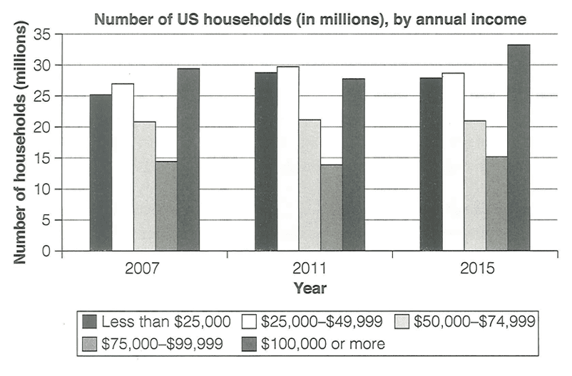
The chart below shows the number of households in the US by their annual ’ income in 2007, 2011 and 2015.
Summarise the information by selecting and reporting the main features, and make comparisons where relevant.
Summarise the information by selecting and reporting the main features, and make comparisons where relevant.
The bar chart illustrates the distribution of US households across five annual income brackets for the years 2007, 2011, and 2015. The figures are presented as percentages of total households.
Overall, it is evident that the proportion of households in the lower and middle-income brackets remained relatively stable over the period, while the highest income group experienced a notable decline. The most significant change was observed in the $75,000-$99,999 category, which saw a substantial reduction by 2015.
In 2007, the distribution of households was relatively balanced across the income brackets. The $75,000-$99,999 category had the largest share at 29.5%, followed by the lowest income group at 25.5%. The middle brackets, $25,000-$49,999 and $50,000-$74,999, both accounted for 14.5%, while the highest earners represented 20.5% of households.
By 2011, the pattern remained largely unchanged, with the $75,000-$99,999 bracket still holding the largest proportion at 29.5%. The lowest income group had increased marginally to 28.5%, while the highest earners had declined to 19.5%. The middle brackets remained steady at 14.5% each. This suggests that the economic conditions during this period had a modest impact on household income distribution.
However, by 2015, a more pronounced shift had occurred. The proportion of households earning between $75,000 and $99,999 plummeted to 18%, representing a drop of more than 11 percentage points from 2007. Meanwhile, the percentage of those earning $50,000-$74,999 declined sharply to just 15.5%, down from 29.5%. In contrast, the lowest income bracket saw an increase to 28.5%, and the highest earners fell further to 15.5%.
In conclusion, the data reveals a significant polarisation in US household income distribution over the eight-year period, with a notable decline in the middle-to-upper income brackets and a corresponding rise in lower-income households, suggesting a potential widening of the wealth gap.
Band Score 6The bar graph compares the number of the United States households on the basis of five different annual income categories in 2007, 2011 and 2015. Overall, it can be seen that relatively similar and the least number of households had $75,000-$99,000 income, while the majority accounted for income $100,000 or more throughout the given years. In addition, the number of households who had less than $25000 to $49, 999 annual incomes were relatively stable in each year. Around 25 million households had less than 25, 000 dollars annual income in 2007, and this number increased significantly in next years with 3 million. Similarly, the number of households with $25, 000 to 49, 999 also rise over the period and recorded around 27 million in 2011. Next two categories from $50, 000-$74, 999 and $75, 0000 to $99,999 remained same in each year which made up approximately 21 million and 9 million respectively. The figure of households who earned $10, 000 or more showed a different pattern which increased dramatically from around 29 million to approximately 32 million in the last given year.
Band Score 7The bar chart compares the number of US households in five annual income categories in 2007, 2011 and 2015 Overall, the number of households earning $100,000 or more increased significantly over the period. By contrast, the $75,000–$99,999 group remained the smallest, while the middle-income categories changed very little. In 2007, around 25 million households earned less than $25,000, compared with approximately 27 million in the $25,000–$49,999 category. These figures rose to about 29 million and 30 million respectively in 2011 before changing only slightly in 2015. The number of households earning $50,000–$74,999 stayed close to 21 million throughout the period. The $75,000–$99,999 category was consistently the smallest at around 14–15 million. In contrast, households with incomes of $100,000 or more increased from about 29 million in 2007 to roughly 33 million in 2015, making it the largest group by the end of the period.
Band Score 6.5The bar chart shows the number of households in the US by five income groups in 2007, 2011 and 2015. Overall, the number of households in the highest income group increased by the end of the period. In contrast, the other groups changed only slightly over the three years. In 2007, the largest group was households earning $100,000 or more, at about 30 million. The group earning $25,000–$49,999 was also quite high, at around 27 million. The smallest group was $75,000–$99,999, with about 15 million households. In 2011, the $25,000–$49,999 group increased slightly and became the largest group, at about 30 million. The highest income group decreased a little to just under 30 million. Other groups stayed almost the same. In 2015, the number of households earning $100,000 or more increased significantly to around 33 million, becoming the highest again. The other income groups remained fairly stable with small changes.
Band Score 6.5The bar chart shows the number of U.S. households (in millions) across different annual income brackets in 2007, 2011, and 2015. Overall, households earning $100,000 or more represented the largest group in both 2007 and 2015, while the $75,000–$99,999 bracket consistently had the lowest figures throughout the period. In 2007, around 29 million households earned $100,000 or more—the highest among all brackets. That number dipped to 27 million in 2011, then rose to a peak of 33 million by 2015. Meanwhile, households making under $25,000 totaled about 25 million in 2007, edged up slightly in 2011, and then fell back to 27 million in 2015. The middle-income categories showed more stable trends. The $50,000–$74,999 and $75,000–$99,999 groups remained relatively flat across the three time points, at roughly 21 million and 15 million households, respectively. However, the $75,000–$99,999 bracket did experience minor fluctuations, moving from 14 million in 2007 to 13 million in 2011, before rising again to 15 million by 2015.
Band Score 6The bar chart represents the quantity of households in the USA by their annual income between years of 2007,2011 and 2015. Overall,the chart includes the number of households in millions and the incomes which are:less than $25 000,$25 000-$49 999,$50 000-$74 999,between $75 000 and $99 999 and lastly $100 000 or more. First of all, in 2007 almost 15 million of households had an income between $75 000 and $99 999 and didn't changed,only by increasing or decreasing by the number of hoseholds untill 2015.In addition to that, 20 million rounded households whose incomes are $50 000-$74 999 also stayed the same in these three years.Moreover,in 2007 almost 27 millions of households had an income $25 000-$49 999, and the quantity of people in 2011 increased to almost 30 millions,but it suddenly decreased to 28 millions in 2015.Freqently,25 millions of people had an income less than $25 000 in 2007,and the number of people increased to 29 millions in 2011 and furthermore decreased to 27 millions in 2015.And lastly,households whose income is $100 000 or more were almost 30 million in 2007,it unexpectedly decreased to 27 millions 2011,and peaked its quantity in 2015 reaching to almost 33 millions.
Band Score 6.5The bar chart illustrates the percentage of households in the United States by annual salaries in 2007, 2011, and 2015. The number will be measured in millions. Overall, households that received $100,000 or more were dominant in 2007 and 2015, while the $75,000-$99,999 category was at the lowest amount of them. By 2007, roughly 29 million households received $100,000 or more, making it the highest paid. The number declined in 2011 to 27 million and peaked at 33 million by 2015. Additionally, approximately 25 million households received less than $25,000 at the first period before witnessing a slight rise by 2011, and dropped to 27 million by 2015. The $50,000-$74,999 and $75,000-$99,999 groups experienced a plateau for three years, making it 21 million households for the first category and 15 million for the second. In the meantime, the $75,000-$99,999 groups fluctuated gradually, reaching 14 million by 2007, 13 million by 2011, and grew to 15 million by 2015.